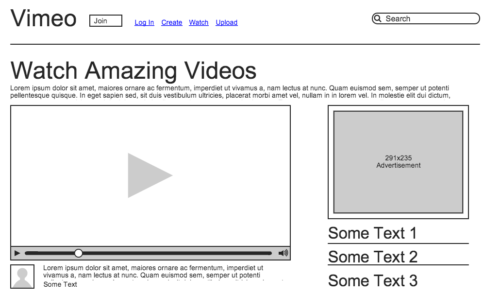
Vimeo
Vimeo's Watch page does a nice job of taking the concept of "what should we show the user?" and making it manageable. When faced with the aforementioned question, the tendency would be to provide the user many examples and let him/her choose. Instead, Vimeo decreases the clutter and "noise" that would provide and instead provides the user with one popular video to watch. In addition, the user can keep scrolling past the video and select from a number of categories. In terms of visual challenges, Vimeo resists the urge to provide too much content and instead, finds a nice balance between content and appearance, and they are certainly in sync with one another.
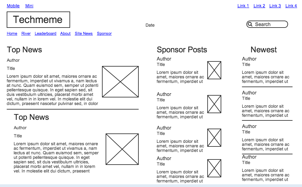
Techmeme
Techmeme solves the problem of "with so much tech news, what do we show the user?" by determining which stories would generate the greatest amount of interest from the most people. It seems simple but it definitely is not. Techmeme allows its users to peak under its hood by providing them with a "Leaderboard" of publications from which it gets its news. Fascinating stuff! In terms of visual challenges, Techmeme succeeds in making tech news easily digestible and accessible. With so much information to provide, like Vimeo, it would be easy for Techmeme to go overboard. Thankfully, they don't.
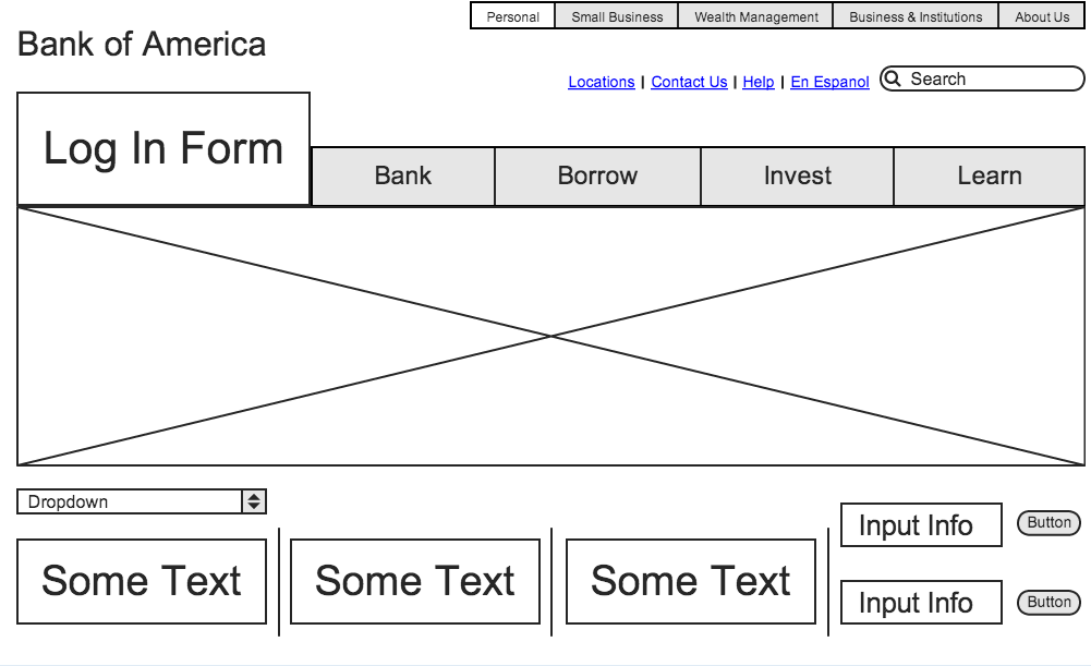
Bank of America
The Bank of America (BOA) website does a brilliant job of condensing information relating to the banking industry and BOA in general, and making it easy to navigate. For an industry that is intrinsically flavorless, BOA does a nice job of spicing up its website with nice big links and tabs. With regards to visual challenges, BOA's site is well spaced so that the information doesn't seem crowded or intimidating. Instead, it feels open and friendly.